ITHIL

Brand Strategy + DeFi UI/UX Design

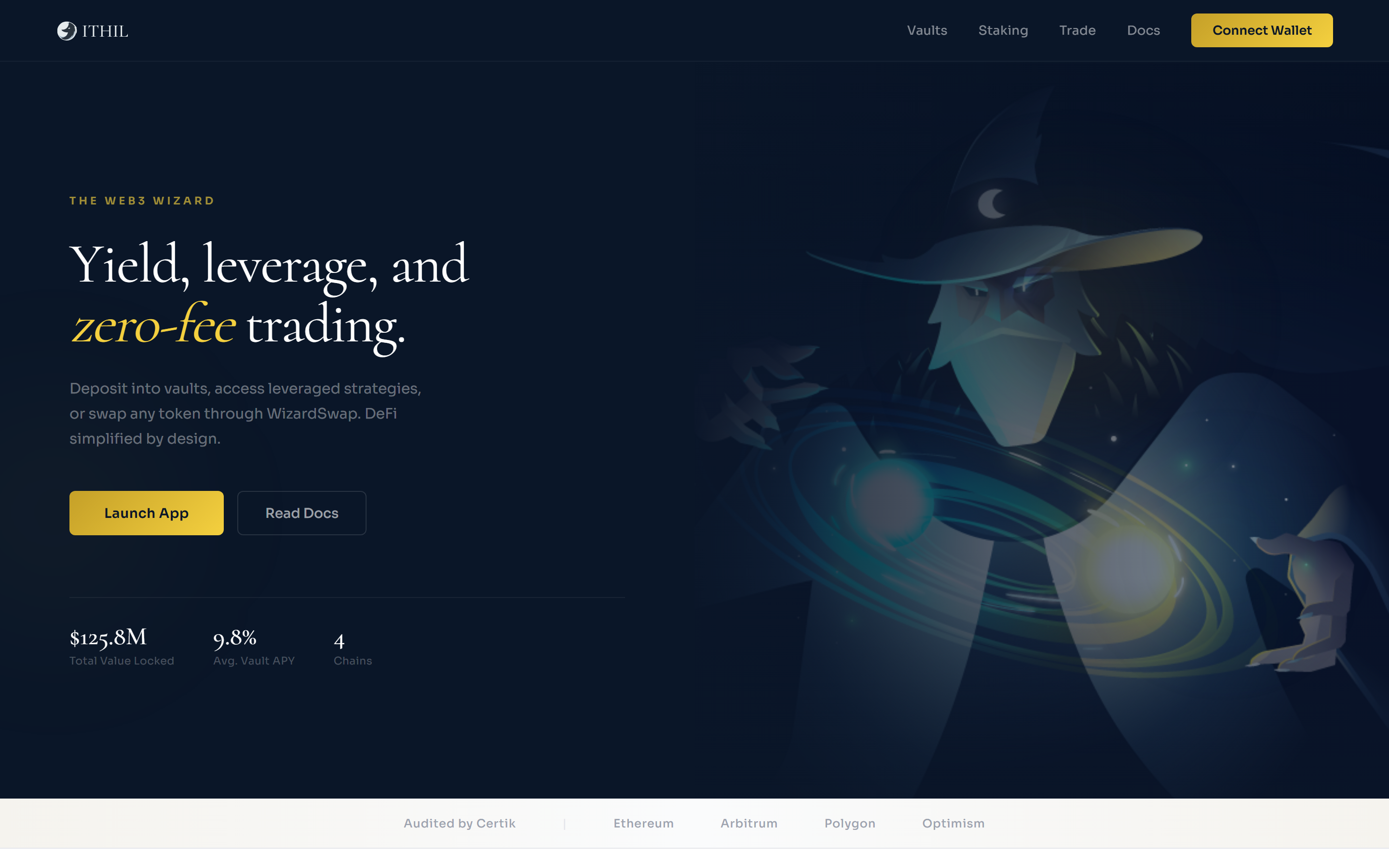
ITHIL had a logo and a name. Through brand workshops I defined their positioning, personality, voice, and visual identity. Then I designed the full DeFi platform UI - landing page, dashboard, vaults, trade, and staking.

Year
2020 - 2021
Role
Brand Strategist + UI Designer
Industry
DeFi / Web3
Archetype
Sage + Magician
Brand StrategyPositioningVisual IdentityUI/UX DesignPrototyping
ITHIL DeFi landing page
Brand Strategy

ITHIL had a logo and a product. No positioning, no voice. Through workshops I defined who ITHIL is and how it should speak.

Deliverables
-Brand positioning
-Personas (Alex + Ema)
-Competitor analysis
-Personality + DNA
-Voice + tone
-Brand guide (40+ pages)
The Archetype

60% Sage. 40% Magician.

The Sage brings knowledge. The Magician brings wonder. Together: a wise guide who knows magic - the Web3 Wizard.

Not a cold institution. A knowledgeable friend. "Your guide in the DeFi universe."

This archetype shaped every visual decision: the wizard hero illustration, the warm cream interface, the mystical golden orbs, and the way error messages explain rather than punish.

User Flow

Ema's first deposit

Ema is 26, new to crypto. She wants passive income but is afraid of losing money. The journey was designed around her anxiety, not around what's technically possible.

01
Landing page
She sees the value proposition and wizard theme. TVL and audit badges build trust.
02
Connect wallet
MetaMask popup. She hesitates. Security badge + non-custodial explanation.
Peak anxiety. 40% drop here.
03
Welcome tour
Experience level selector adjusts what she sees. Progressive disclosure starts.
04
Browse vaults
Vaults with APY, TVL, risk badges. Filters by Low Risk. Color-coded clarity.
05
Select vault
ETH vault. 12.4% APY, Low Risk. Plain language explanation.
06
Deposit
0.5 ETH. Expected returns, risk disclosure, withdraw anytime.
Second anxiety peak. Clear cost breakdown.
07
Success
Position visible in dashboard. Wizard Tip suggests checking back in a week.
Wireframes

Information hierarchy before visual design.

Dashboard
Logo
Wallet
TVL
Earned
APY
Pos.
Chart
Table
Vaults
Logo
Wallet
All
ETH
MATIC
Vault rows
WizardSwap
Logo
Wallet
Pay
|
Get
Swap
Chart
Info
UI/UX Design

Full platform: landing page, dashboard, vaults, trade, staking. Each screen handles two user types - Alex the experienced DeFi user and Ema the cautious newcomer.

Challenge

Two users, one interface. Progressive disclosure surfaces depth on demand.

Decisions
01
Warm cream, not cold gray
Warm tones from the wizard imagery instead of typical DeFi gray. Builds trust before content does.
02
Golden CTAs
Brand gold reserved for primary actions. Makes the next step always obvious.
03
Risk badges
Green for low, gold for medium, coral for high. Color codes risk before users read it.
04
Wizard Tips
Contextual sidebar guidance. Educates without being condescending.
Coded Prototypes

Five HTML pages built from scratch. Warm cream theme, navy sidebar, golden CTAs. Real interactions, not mockups.

Dashboard
Dashboard
Vaults
Vaults
WizardSwap / Trade
WizardSwap / Trade
Staking
Staking
Design System

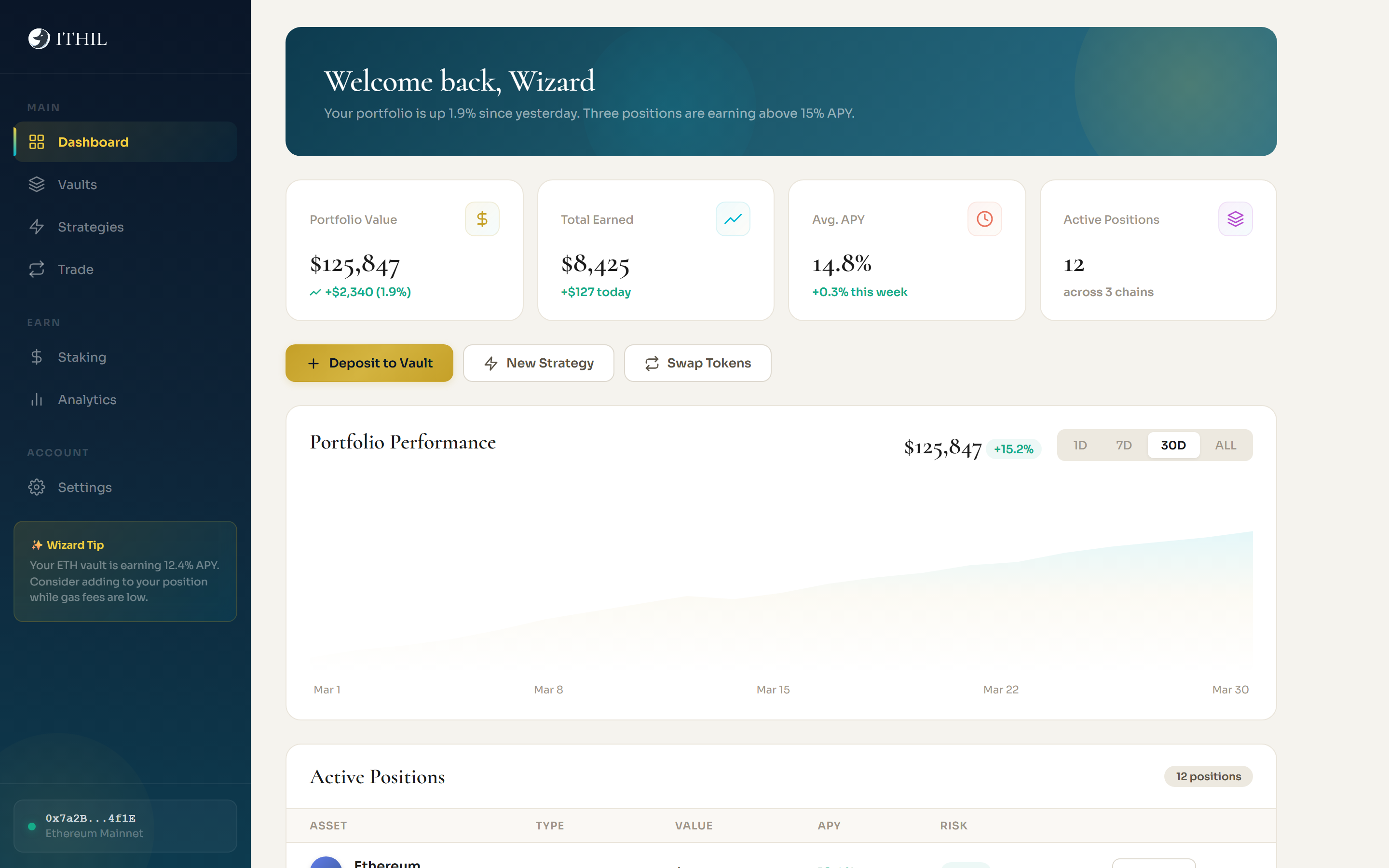
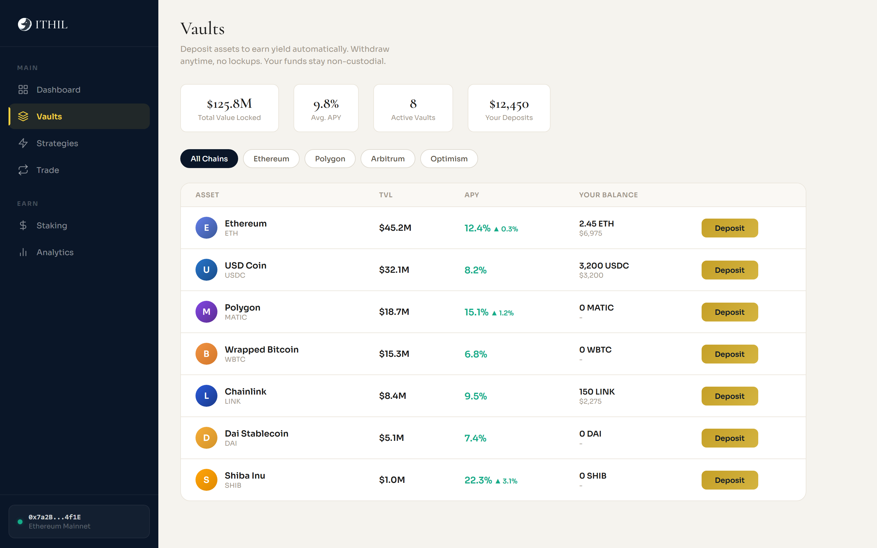
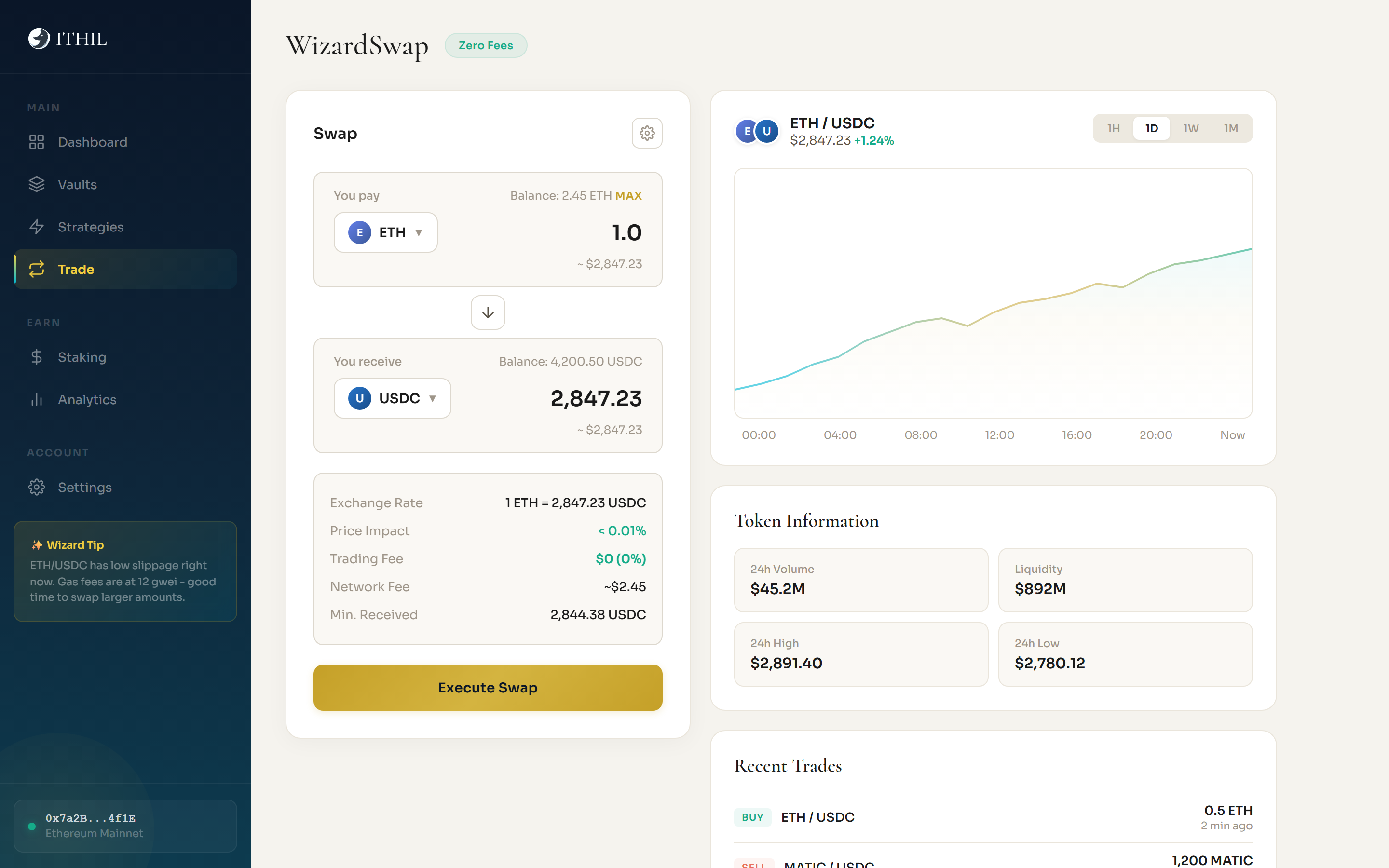
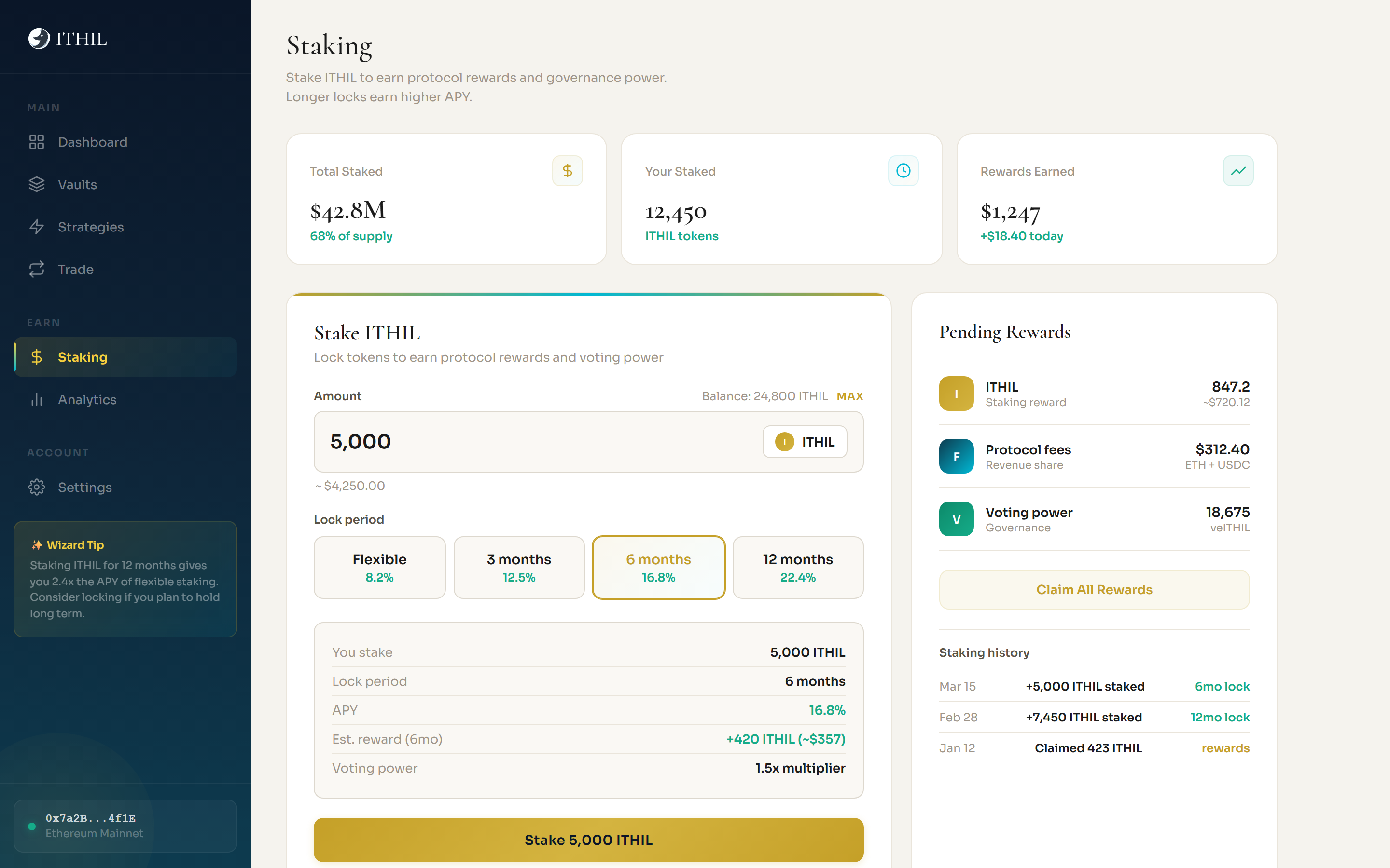
Navy + gold on dark for the marketing site. Warm cream + teal on light for the app interface.

Cormorant for headings (authority + warmth). Sora for UI (clarity).

palette
--navy
Dark bg
--gold
Accent
--teal
Gradients
--cyan
Charts
--success
APY
--coral
Risk
Outcome

Brand identity + DeFi platform. Workshops to brand guide to coded prototypes. Five fully functional HTML pages with the complete design system.

Brand StrategyPositioning + voice
Brand Guide40+ pages
PersonasAlex + Ema
User FlowsDeposit journey
Wireframes5 key screens
Prototypes5 HTML pages