EFEJ Portes Ouvertes 30 ans
Full visual identity system for Espace Formation Emploi Jura - the public organization that supports professional reintegration in Canton Jura. From custom wordmark to printed signage to social media rollout. 18 deliverables in total.
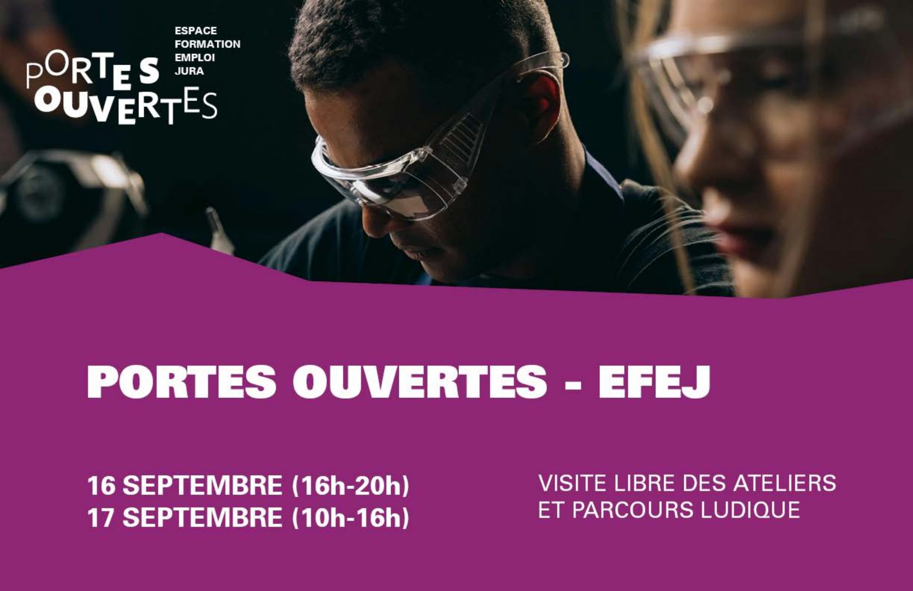
EFEJ is a Jura cantonal organization helping people back into work. For their 30th anniversary, they hosted Portes Ouvertes - two days of open workshops, public visits, and reintegration storytelling.
They needed a complete visual identity: not just a logo, but every touchpoint a visitor would see, from the village entrance signs to the staff t-shirts to the cocktail price list.
A 30-year-old institution needed a visual identity that felt anything but institutional.
EFEJ helps people who have fallen out of the workforce - injury, illness, long unemployment, transition. Their existing visual language was the one you would expect from a Swiss public agency: serious, formal, distant.
The 30-year event was an opportunity to invite the public inside. To show that the people behind reintegration are warm, energetic, human. Visitors needed to feel welcomed before they walked through the door.
One designer. One brief. Four months from kickoff to print-ready files. Every deliverable had to work together, but each one had its own production constraints - silkscreen on textile, large-format outdoor printing, RGB for LinkedIn, CMYK for press.
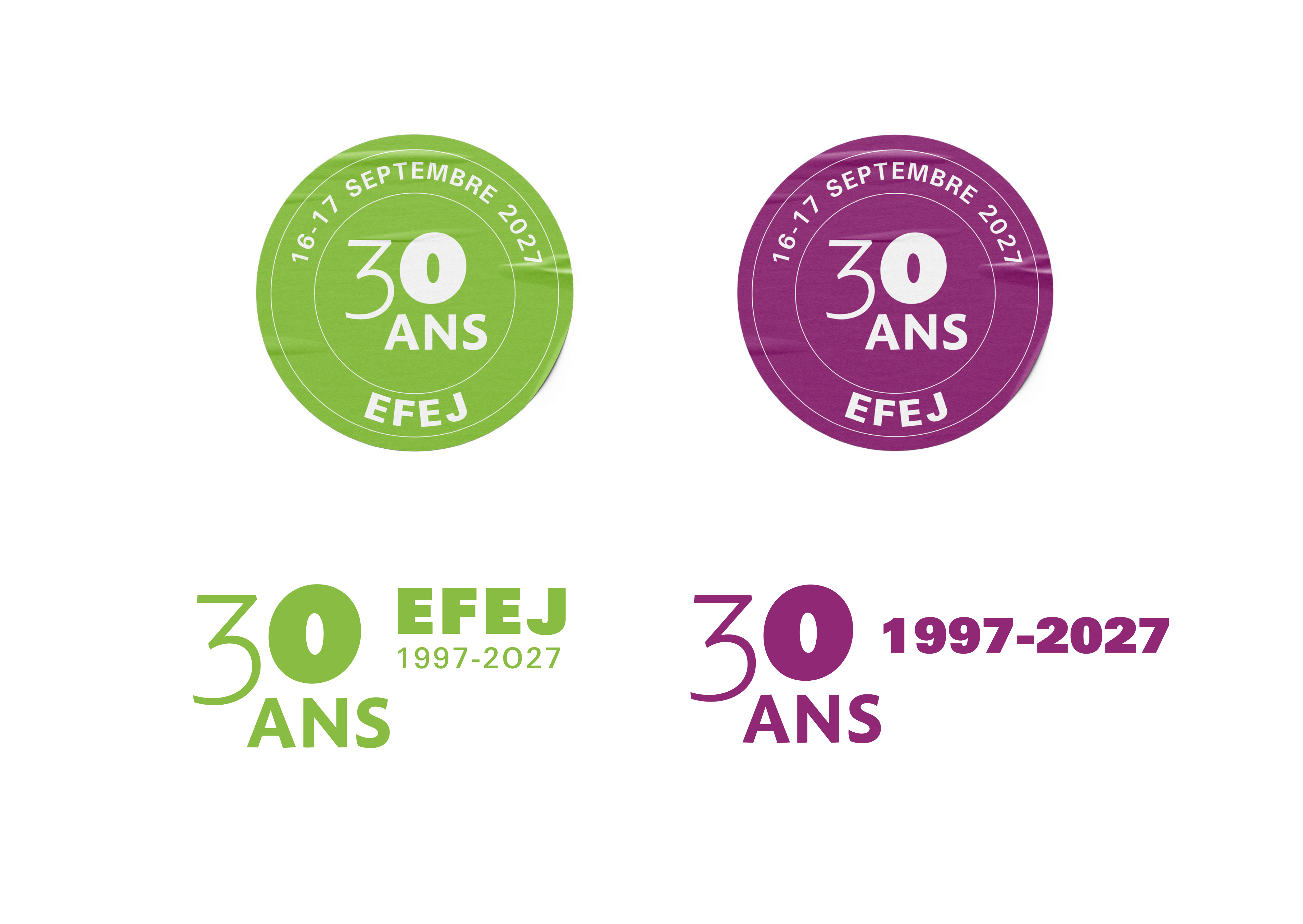
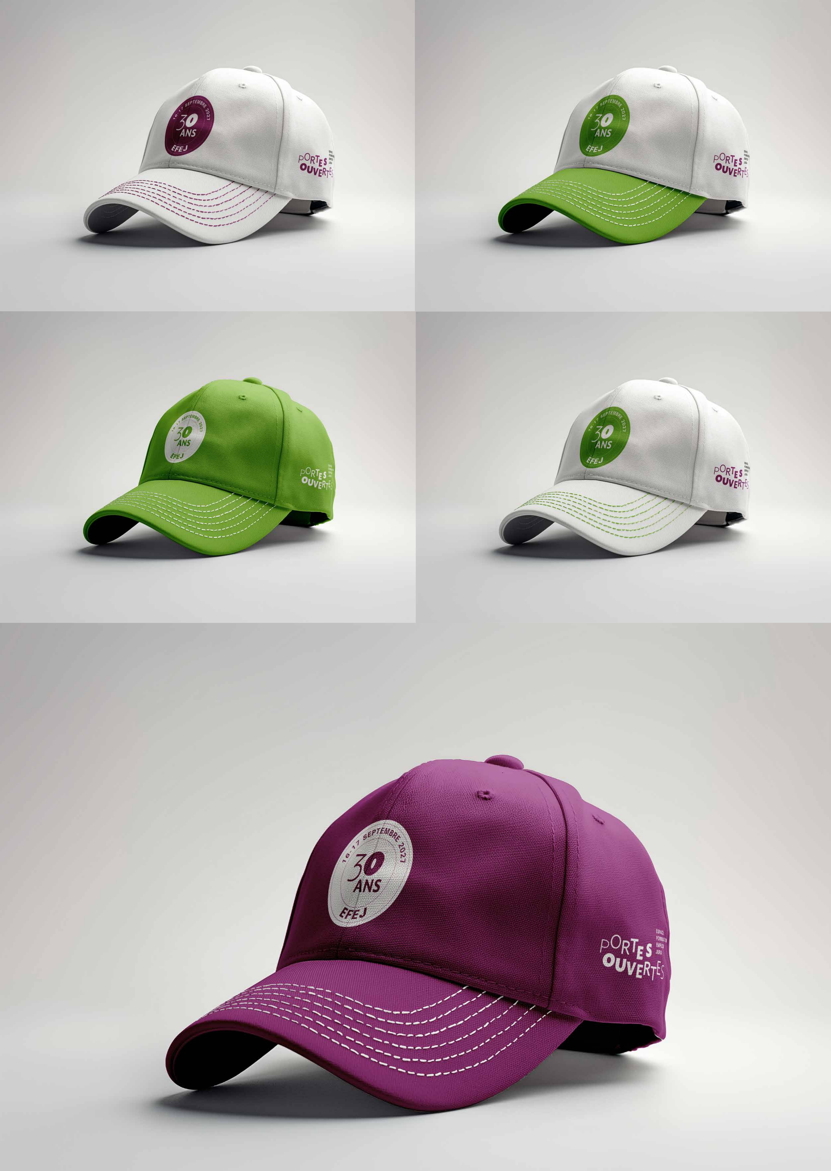
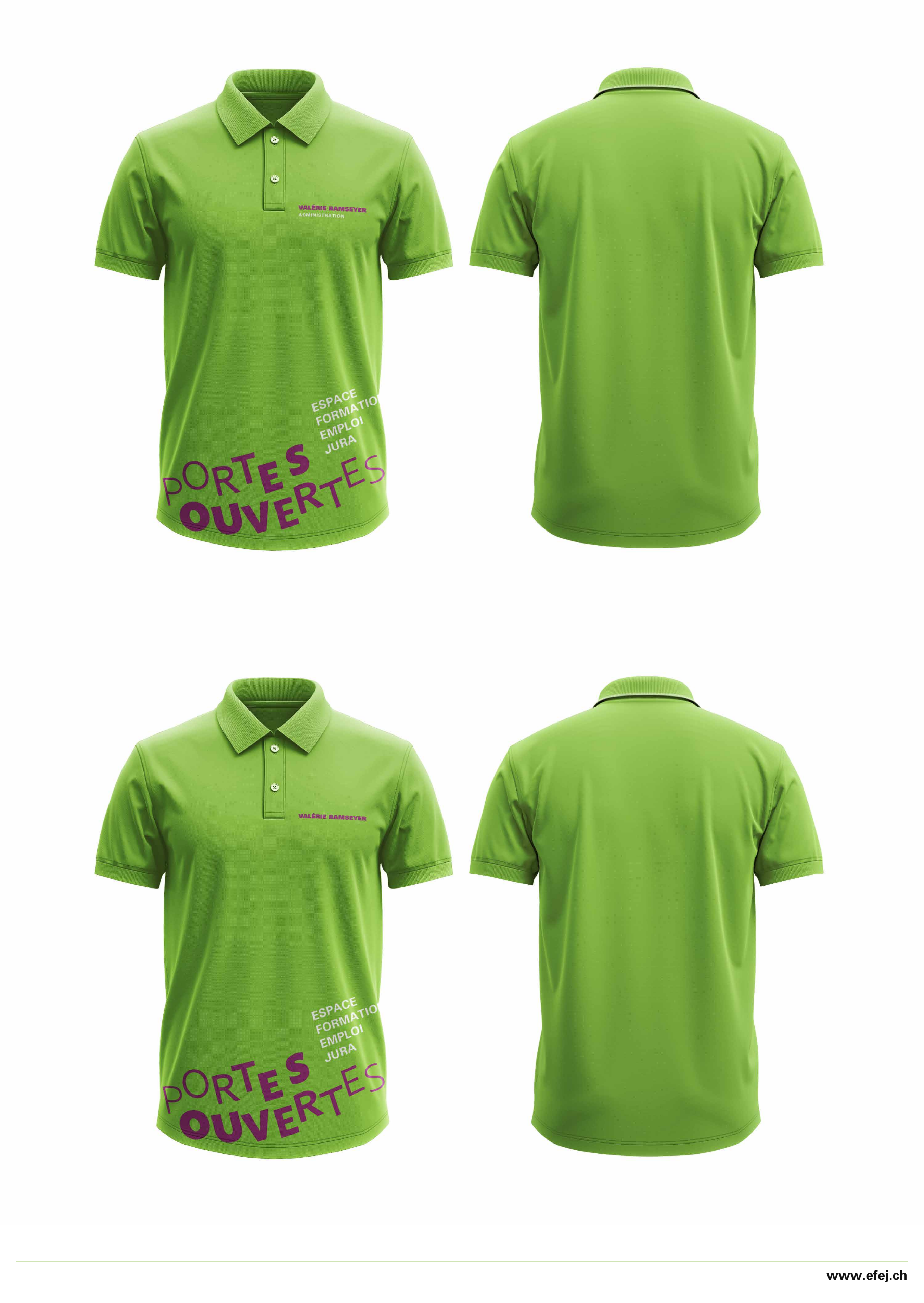
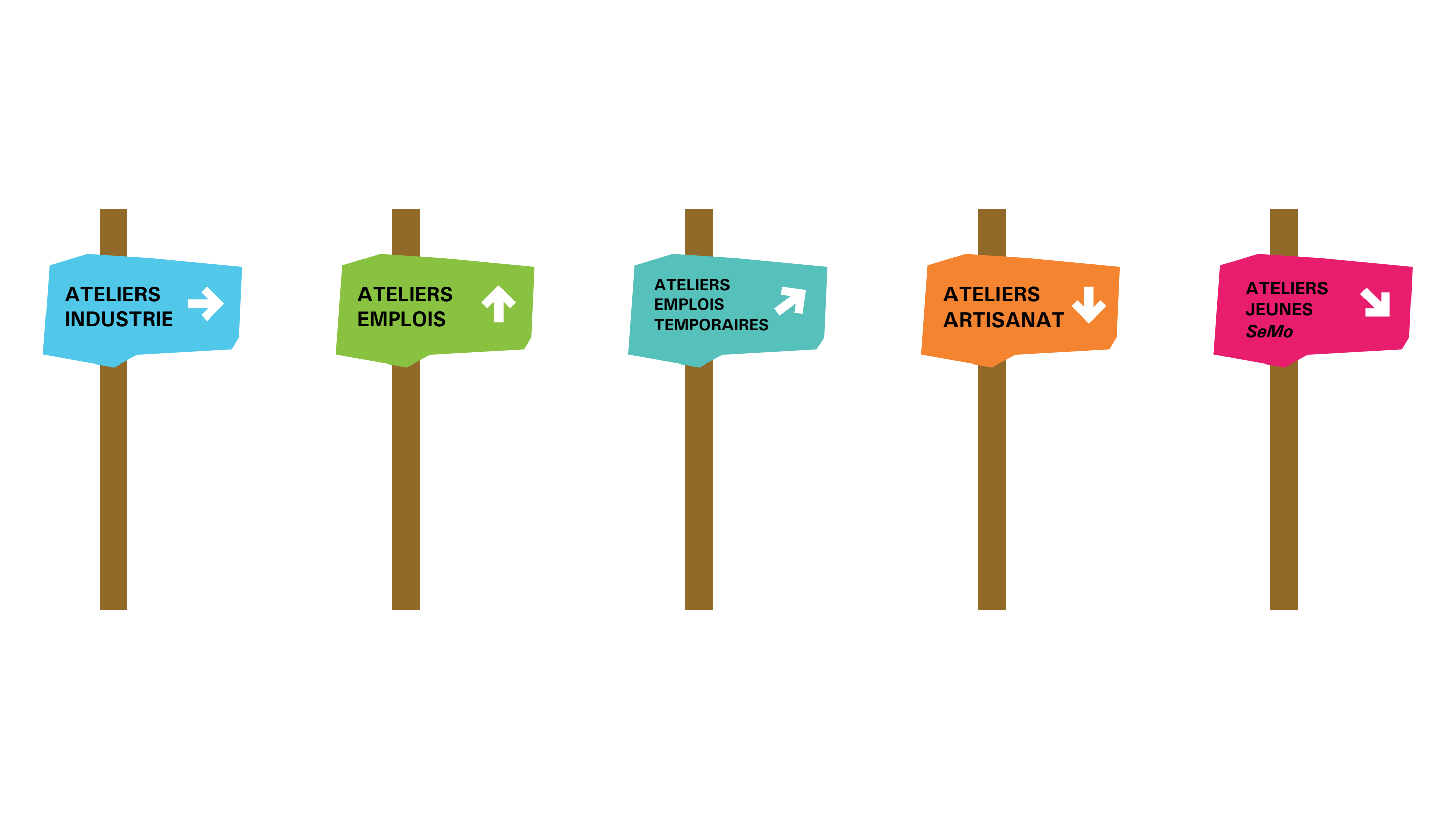
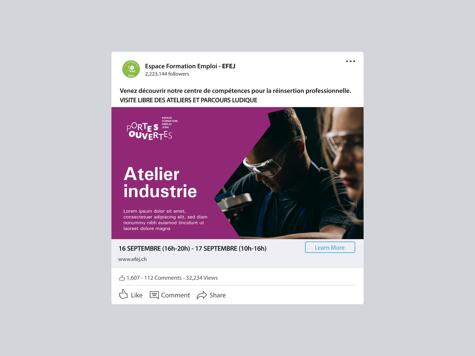
Plum purple anchors the system, with five secondary colors that map to the five categories of workshops: ateliers, emplois, jeunes, industrie, artisanat. Visitors learn the system through repetition across signage and print.
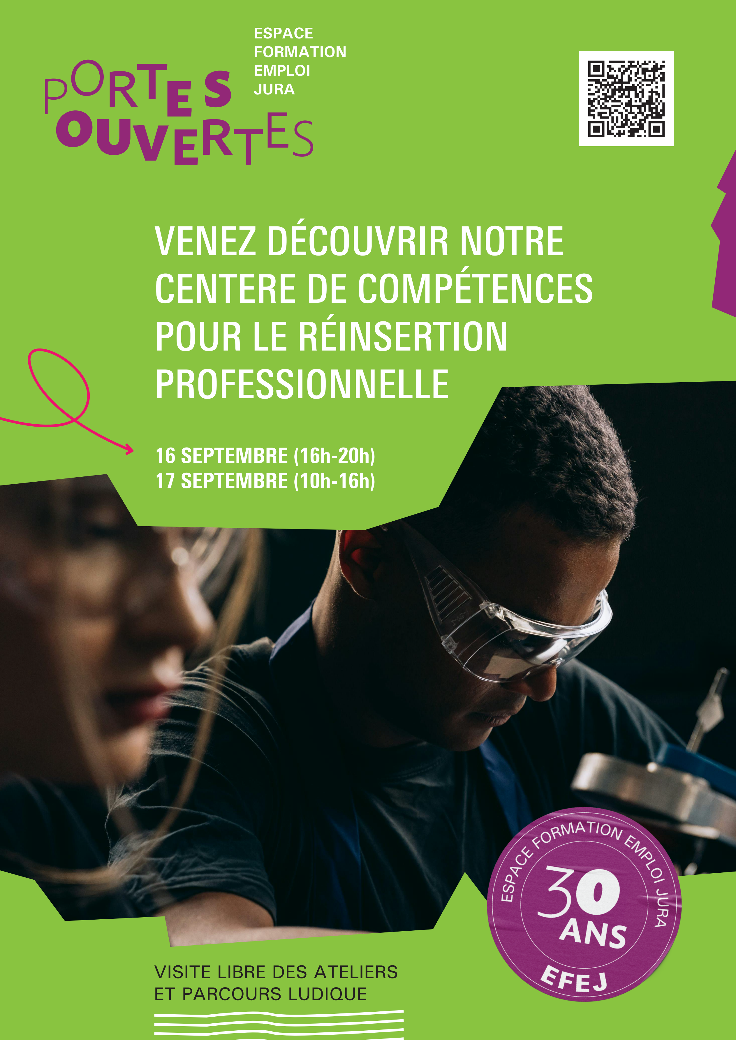
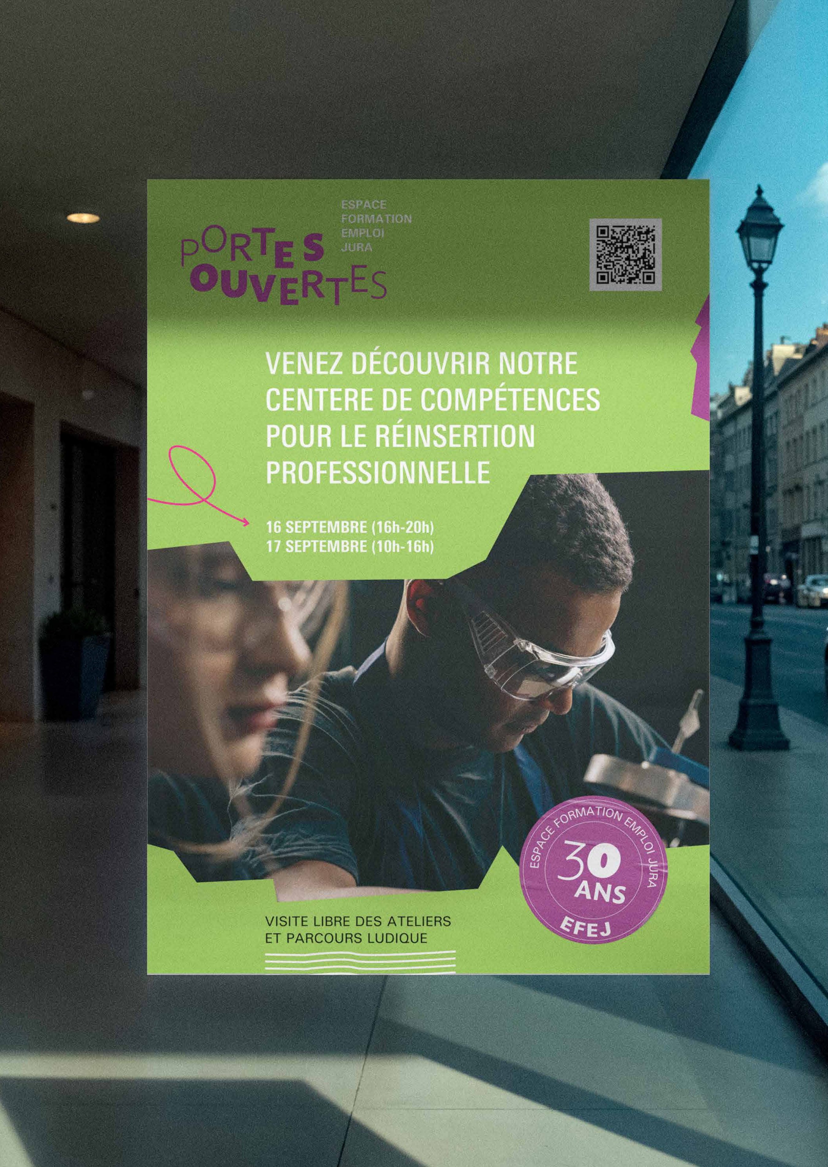
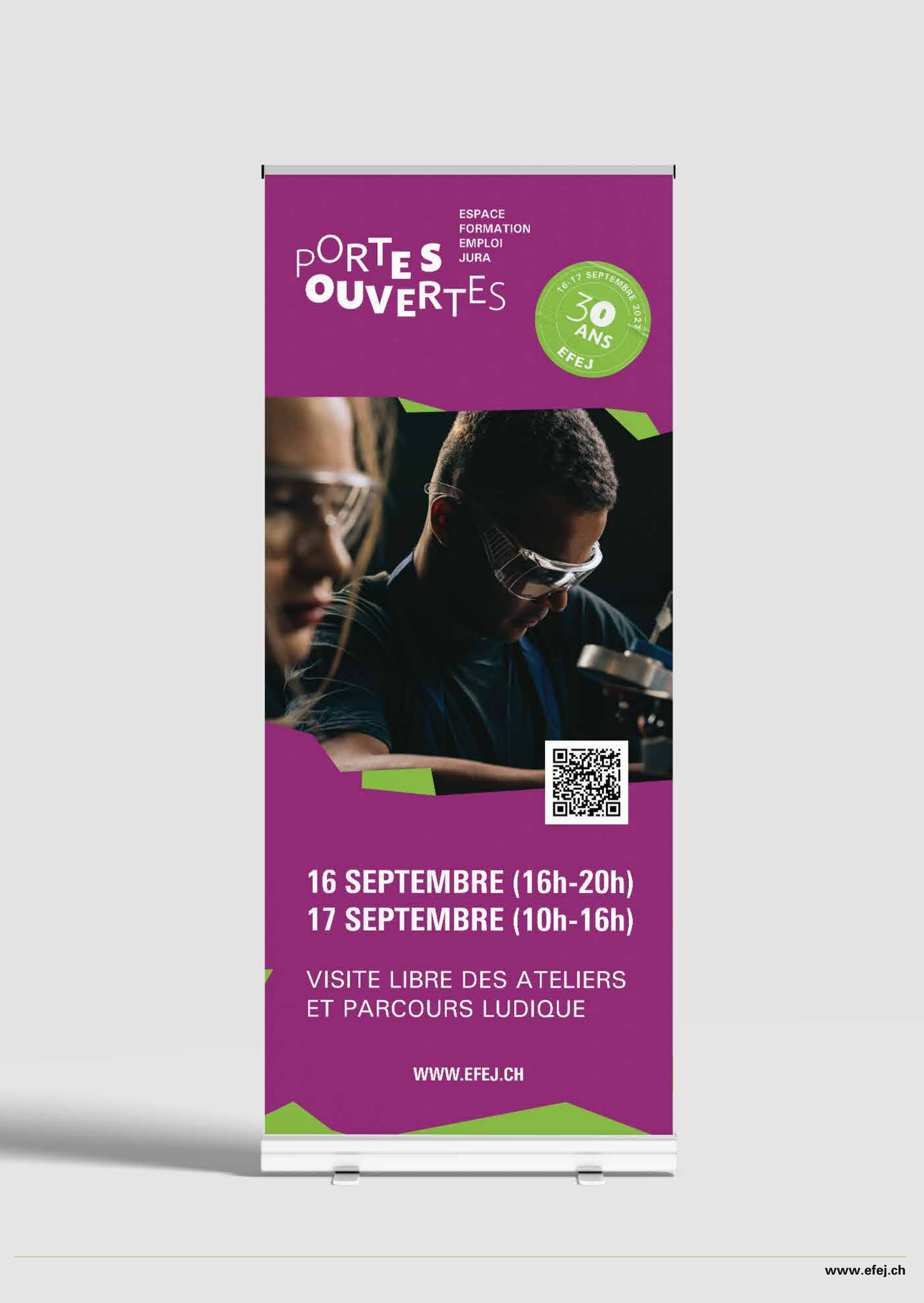
The hero poster uses lime green, hand-drawn lasso accents, real photography of EFEJ workshop participants, and the 30-year anniversary stamp. Distributed by mail, in shop windows, and at train stations across Canton Jura.
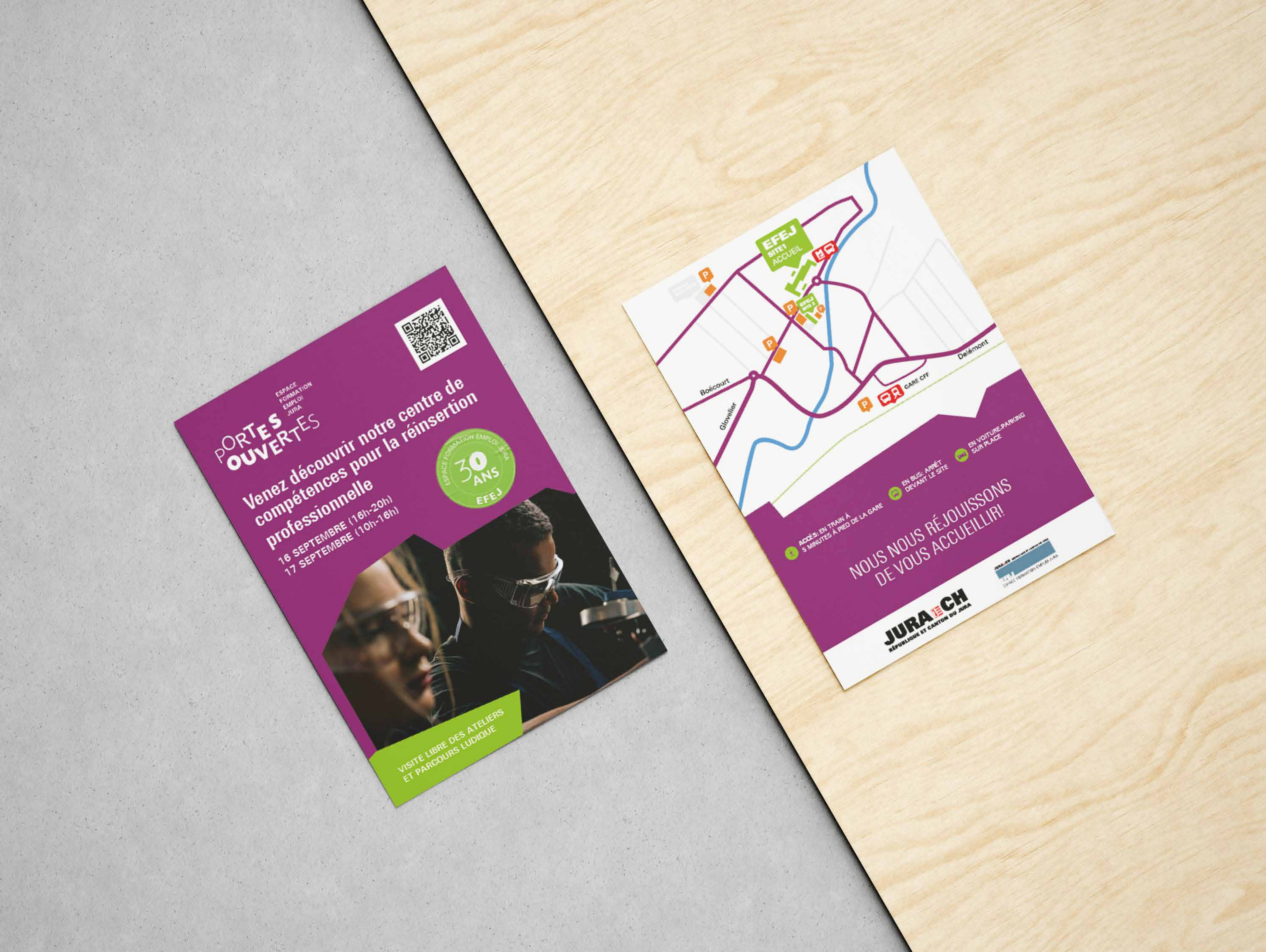
Two-sided flyer: front for the event invitation, back with the route map showing how to reach the EFEJ site by train, bus, or car. Mailed to local Jura households and distributed at partner sites.
Staff and volunteers wore branded caps and T-shirts in the brand colors. The mark scaled cleanly from a small embroidered cap badge to the back of a t-shirt without losing legibility.
Visitors arrive by train, bus, or car. The wayfinding system used directional arrows, village entrance panels, and the color-coded category system - ateliers, emplois, jeunes, industrie - so people could navigate the workshops without staff intervention. Roll-up banners anchored each entry point.
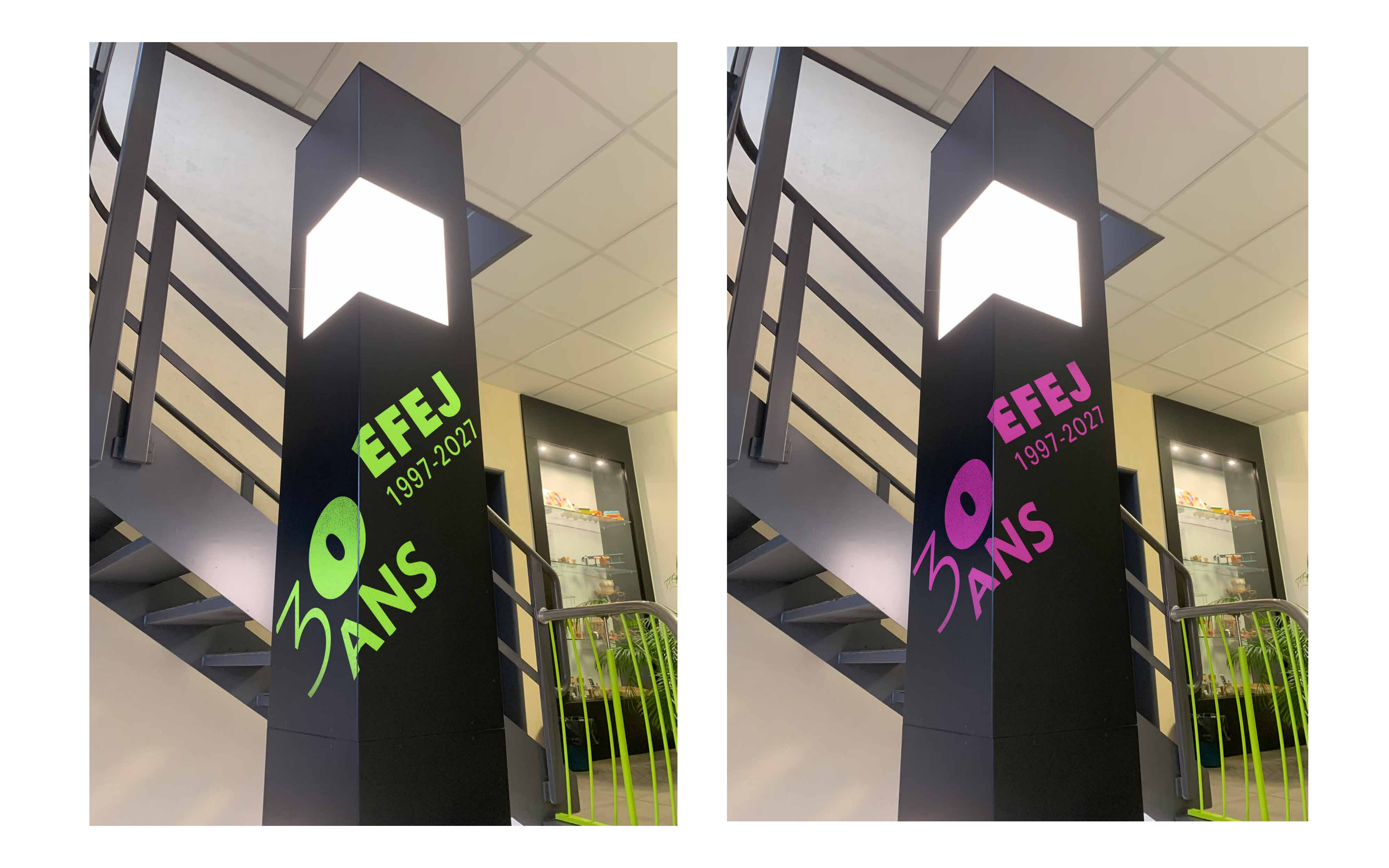
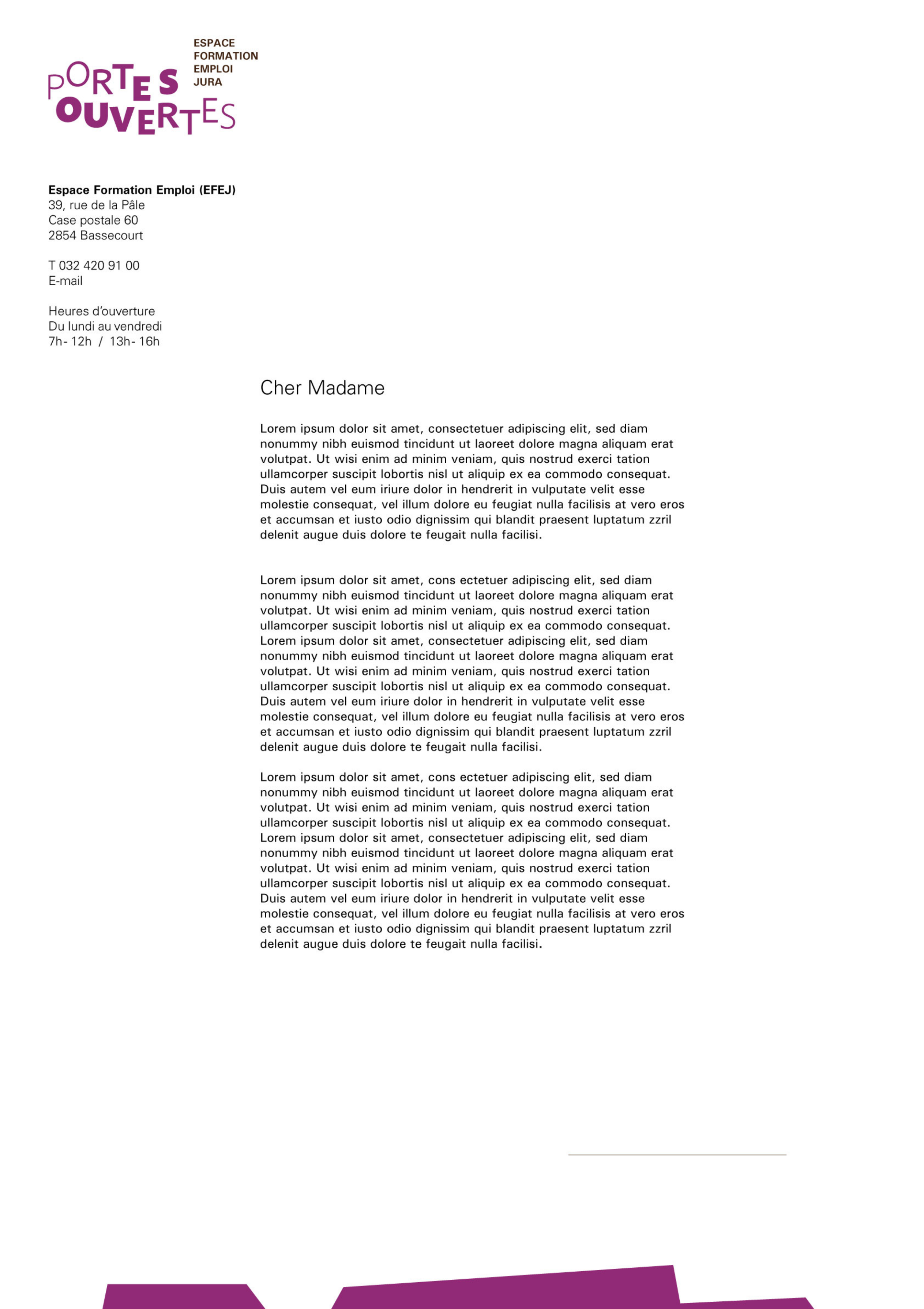
LinkedIn post for EFEJ's official channel, mailed invitation letter to local stakeholders, and the illuminated step lights that guided visitors through the EFEJ entrance during the evening hours of day one.
The mark had to do four jobs at once: feel warm, signal a real event, scale from a badge to a building panel, and survive a French-speaking, multi-generational Jura audience.
The Portes Ouvertes event ran on 16-17 September 2025 across the EFEJ site in Canton Jura. Every printed and digital touchpoint shipped on time. The visual identity is now in EFEJ's brand archive and used for ongoing reintegration communications.